Choosing the right color palette for a room is one of the most powerful decisions you can make when decorating your home. It sets the mood, reflects your personality, and can even make a small space feel larger or a large room feel more cozy. But with thousands of paint swatches and inspiration boards out there, it’s easy to get overwhelmed. The good news? You don’t need a design degree to pick the perfect color scheme. With a few smart strategies and a bit of self-reflection, you can confidently choose a color palette that transforms any room into a space you love.
In this article, we’ll guide you through simple yet effective steps to help you choose the perfect color palette for any room in your home—whether it’s a relaxing bedroom, a vibrant living room, or a clean, modern kitchen.
1. Start With the Feeling You Want to Create
Before you even look at paint samples, take a moment to think about how you want the room to feel. This is the most important first step.
- Do you want your bedroom to feel restful and serene? Stick with cool tones like soft blues, greens, or muted grays.
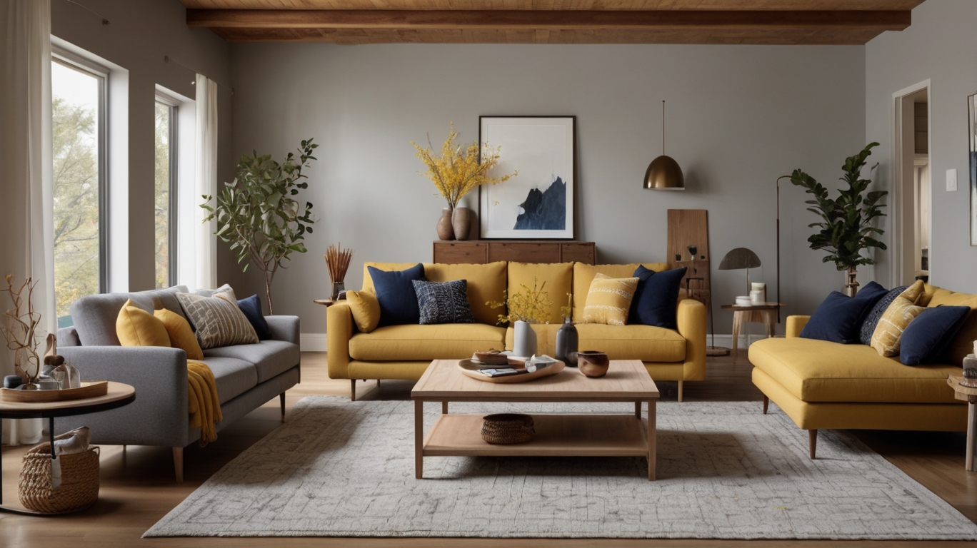
- Want your living room to feel inviting and lively? Try warm tones like terracotta, mustard, or deep olive green.
- Looking for a clean and energizing kitchen space? Crisp whites, bright greens, and cheerful yellows can do the trick.
Colors trigger emotions, so think about how you want people to feel when they walk into the room, including yourself.
2. Get Inspired by What You Already Love
Your closet, favorite vacation photos, or a piece of art you own can all be great sources of inspiration. Take a look at your personal style. Are you drawn to earth tones, classic neutrals, or vibrant pops of color?
Walk through your home and notice any consistent themes or tones. If you’re already using blues and whites in one room, you may want to carry some of that through for cohesion—or you might intentionally want to contrast it with something more dramatic in another space.
You can also build your palette around a single item—like a rug, throw pillow, or vintage chair. Choose one main color from that piece and build supporting hues around it.
3. Understand the Basics of Color Theory
Color theory may sound technical, but don’t worry—it’s more intuitive than you think.
Here are a few tried-and-true combinations that designers often use:
- Monochromatic: Variations of a single color (like light blue, medium blue, navy) for a subtle and sophisticated look.
- Analogous: Colors that sit next to each other on the color wheel (such as green, blue-green, and blue). These palettes feel harmonious and are great for calming environments.
- Complementary: Colors opposite each other on the color wheel (like blue and orange or red and green). These can add vibrant contrast and energy.
Not sure where to start? Look up a basic color wheel online or use a free color palette generator to experiment.
4. Choose a Dominant, Secondary, and Accent Color
Designers often follow the 60-30-10 rule when creating a color palette. It breaks down like this:
- 60% Dominant Color: This will be the main color in the room—usually on walls, large furniture pieces, or rugs.
- 30% Secondary Color: This complements the dominant color and adds depth—think curtains, chairs, or bed linens.
- 10% Accent Color: This is where you can have a little fun—throw pillows, artwork, or decorative accessories.
This formula helps create balance and visual interest without overwhelming the space.
5. Consider the Lighting in the Room
Light has a big impact on how colors appear. A color that looks soft and cozy in your paint sample might look harsh under fluorescent lighting or totally washed out in a sunny room.
- North-facing rooms: These tend to have cooler, bluish natural light. Warm colors work well to balance that.
- South-facing rooms: These get a lot of bright, warm sunlight, so you might want cooler tones to neutralize the intensity.
- Rooms with limited natural light: Choose light, reflective colors like soft cream, pale gray, or warm white to open up the space.
Before committing, test a few paint swatches on different walls at different times of day. What looks good in the morning may feel completely different at night.
6. Think About Flow Between Rooms
Especially in open-concept homes or small spaces, the way one room flows into another can make or break your color scheme. While each room doesn’t need to be identical, you do want a sense of cohesion.
One approach is to pick a neutral base (like a soft gray or beige) that shows up throughout the home and layer in different accent colors for each space. This keeps everything feeling tied together without being repetitive.
If you prefer more color variety, make sure the undertones of your chosen colors are compatible—either all cool or all warm—to create visual harmony.
7. Use Neutrals as Your Base
Neutral tones like white, cream, beige, taupe, and gray are incredibly versatile and provide a blank canvas for more dramatic accents. They make rooms feel calm, open, and easy to update with seasonal décor.
But not all neutrals are created equal. Look closely at undertones:
- A gray with blue undertones can feel cold, while one with warm brown undertones feels cozier.
- Cream may appear yellowish in some light, so always test samples on your walls before making a final decision.
8. Don’t Be Afraid of Bold Colors
While neutrals are safe, bold colors can make a statement—especially in rooms where you want a focal point.
- A deep navy in a dining room can feel dramatic and elegant.
- Terracotta in an entryway brings warmth and character.
- Teal or emerald green in a study adds richness and a touch of luxury.
If you’re nervous about committing, start small. Paint one accent wall or incorporate bold colors through furniture or accessories.
9. Test Before You Commit
Paint stores often offer sample sizes. Buy a few, and paint swatches directly on your wall, not just the paper. Live with them for a few days and see how they look under morning light, afternoon sun, and evening lamps.
Even better, tape off a small area of the wall and paint a larger patch so you can get a better sense of how it will feel when the whole room is done.
10. Trust Your Instincts
Ultimately, the best color palette is one that makes you happy. Trends will come and go, but you’re the one living in the space every day. If you’re drawn to something a little unconventional, go with it. Your home should reflect your personality—not a magazine spread.
Design is about creating a space that feels uniquely yours. So don’t stress too much about making it perfect. Focus on making it you.
Final Thoughts
Choosing the perfect color palette for any room doesn’t have to be stressful. With a little planning and a lot of inspiration, you can create a color story that not only looks beautiful but also makes your home feel more like home. Start with how you want the room to feel, get inspired by what you love, and don’t be afraid to experiment. Whether you lean minimalist or bold, warm or cool, your perfect palette is just a few swatches away.